3.3 Understanding Health Data Distribution
Now that we have reviewed our data for missingness and outliers, we are ready to begin looking at the distributions of our data elements.
Proior to embarking on in-depth analyses or predictive modeling, understanding the distribution of health data is paramount.
Descriptive statistics provide an initial glimpse into the data's central tendency and spread, while distribution curves offer insights into the prevalence of specific medical conditions within a population. While traditional statistics often assume a normal distribution, healthcare data rarely adheres to this idealized curve.
This section will guide you through the fundamentals of descriptive statistics and distribution curves in the context of healthcare data. We'll showcase Python tools to calculate mean, median, variance, and visualize distribution curves. Furthermore, we'll explain the significance of various distribution shapes, including skewed, bimodal, and uniform, and provide real-world healthcare examples to contextualize these concepts.
Descriptive Statistics
Descriptive Statistics: Descriptive statistics are fundamental tools in the realm of data exploration. They provide a snapshot of the data's central tendencies, spread, and shape. For health data, these statistics are particularly valuable as they enable insights into medical trends, patient conditions, and treatment outcomes. Some key descriptive statistics and their relevance in the healthcare context include:
Mean
The mean, or average, is a fundamental descriptive statistic that holds significant importance in healthcare data analysis. It offers insights into the central tendency of a dataset and helps identify the typical value of a health metric. Here are some additional healthcare examples that illustrate the importance of the mean:
Laboratory Test Results: Medical laboratory tests provide insights into various health markers. Calculating the mean values of these markers can help establish normal ranges for different patient groups. Deviations from the mean might indicate the presence of underlying medical conditions.
Drug Dosages: Healthcare professionals often prescribe medications based on dosages appropriate for a patient's age, weight, and condition. Calculating the mean dosage of a specific medication within a patient population can guide clinicians in determining suitable dosages for individual patients.
Patient Satisfaction Ratings: Measuring patient satisfaction is essential for improving healthcare services. Calculating the mean satisfaction scores can offer insights into the overall patient experience and guide efforts to enhance the quality of care.
Standard Deviation (SD)
The standard deviation is a crucial statistical measure that is closely linked to the mean. It provides valuable insights into the spread or dispersion of data points around the mean. First, the standard deviation measures the average amount by which individual data points in a dataset deviate from the mean. In other words, it quantifies the spread or dispersion of data around the mean. A small standard deviation indicates that data points are close to the mean, while a larger standard deviation suggests that data points are more spread out.
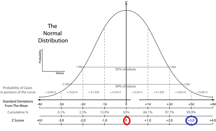
- Relationship to the mean: The standard deviation and the mean have a strong relationship. When data points are clustered closely around the mean, the standard deviation is small. Conversely, when data points are more widely spread out from the mean, the standard deviation is larger.
- In a symmetric, normal distribution, the mean and standard deviation are closely related. The standard deviation gives you an idea of how data points are dispersed around the mean. In a normal distribution, about 68% of the data falls within one standard deviation of the mean, about 95% falls within two standard deviations, and about 99.7% falls within three standard deviations.
- A telltale sign of potentially highly skewed or non-normal data is when the standard deviation is considerably larger than the mean. This can indicate that the data distribution is stretched out due to extreme values in the tail of the distribution.
- Our prior examples:
- Laboratory Test Results: In medical tests, such as blood tests or imaging studies, the standard deviation can indicate the variability of results within a patient population. A smaller standard deviation indicates that test results are relatively consistent, while a larger standard deviation suggests greater variability.
- Drug Dosages: When evaluating the effectiveness of a drug, clinicians often consider both the mean response and the standard deviation of the response. A small standard deviation indicates that patients' responses are consistent, while a larger standard deviation may suggest variable responses.
- Patient Satisfaction Ratings: Standard deviation is used to assess variations in patient satisfaction scores, such as their satisfaction with nursing care with their in-patient stay. A smaller standard deviation implies more consistent satisfaction scores, while a larger standard deviation indicates greater variability in satisfaction.
Median
The median is the middle value when data is ordered. It's a measure of central tendency that's less affected by extreme values. In healthcare, the median can be used to describe the middle value of a set of patient ages, which might be more representative than the mean when dealing with skewed age distributions.
Mode
The mode is the most frequently occurring value in a dataset. Identifying the mode in healthcare data can highlight the most common symptom reported by patients, aiding in understanding prevalent conditions.
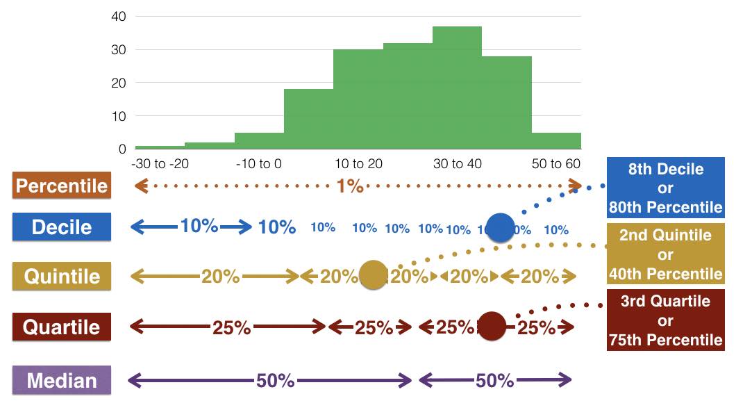
Quantiles and Quartiles
Quartiles and quantiles are both measures used to divide a dataset into specific segments or parts. Quantiles are a more general concept that includes quartiles as a specific case. Let's break down the differences and importance of each:
Quartiles: Quartiles are a specific type of quantile that divides data into four equal parts, each containing a quarter of the data. The three quartiles are:
- First Quartile (Q1): This is the value below which 25% of the data falls. It's also known as the 25th percentile.
- Second Quartile (Q2): This is the median of the data and divides it into two halves, with 50% of the data falling below and 50% above. It's also known as the 50th percentile.
- Third Quartile (Q3): This is the value below which 75% of the data falls. It's also known as the 75th percentile.

Quantiles: Quantiles are a broader concept and refer to dividing a dataset into equal parts. While quartiles divide into four parts, other quantiles can divide data into any number of parts. For instance, quintiles divide into five parts, deciles into ten parts, and percentiles into 100 parts.
- Percentiles: Percentiles are a common form of quantiles, where data is divided into 100 equal parts. The nth percentile is the value below which n% of the data falls.
Quartiles and quantiles play a crucial role in healthcare data analysis for various reasons:
- Understanding Distribution: Dividing data into quartiles or other quantiles helps in visualizing how data is distributed across different segments. This is especially valuable for understanding the spread of patient metrics like cholesterol levels, blood pressure readings, or BMI scores.
- Cutoff Points and Percentiles: Quartiles and percentiles allow us to establish cutoff points. For example, knowing the 25th and 75th percentiles of cholesterol levels helps identify the range within which most patients fall. This aids in defining healthy ranges and identifying outliers or potential health concerns.
- Segmenting Survey Data: In healthcare surveys, quantiles are useful for segmenting respondents based on their answers. For instance, if a survey asks about pain intensity, dividing responses into quartiles can help classify respondents into categories like "low pain," "moderate pain," "high pain," and "severe pain."
- Comparative Analysis: Quartiles and quantiles aid in comparative analysis. You can compare how specific patient metrics or health indicators vary across different percentiles or quartiles, helping to identify trends or disparities.
Quartile Example:
Let's take an example of cholesterol levels in a population and divide it into quartiles to create four groups. Suppose we have the following cholesterol levels for a sample of individuals:
15, 18, 20, 22, 25, 28, 30, 33, 35, 40, 45, 50, 55, 60
Step 1 Calculate Quartiles:
- First Quartile (Q1): This is the value below which 25% of the data falls. In our case, 25% of 14 (total data points) is 3.5, so the value at the 3.5th position is the first quartile. In our dataset, this corresponds to the 4th value, which is 22.
- Second Quartile (Q2): This is the median, which is the value that divides the data into two halves. Since we have an even number of data points (14), the median is the average of the 7th and 8th values, which is (30 + 33) / 2 = 31.5.
- Third Quartile (Q3): This is the value below which 75% of the data falls. 75% of 14 is 10.5, so the value at the 10.5th position is the third quartile. In our dataset, this corresponds to the 11th value, which is 45.
Step 2: Create Quartile Groups: Now we'll use these quartile values to divide the data into four groups:
- Group 1: Below 1st Quartile (Q1) - Cholesterol levels below 22
- Group 2: Between 1st Quartile (Q1) and 2nd Quartile (Q2) - Cholesterol levels between 22 and 31.5
- Group 3: Between 2nd Quartile (Q2) and 3rd Quartile (Q3) - Cholesterol levels between 31.5 and 45
- Group 4: Above 3rd Quartile (Q3) - Cholesterol levels above 45
Step 3: Interpretation:
- Group 1: 25% of individuals have cholesterol levels below 22.
- Group 2: The middle 25% of individuals have cholesterol levels between 22 and 31.5.
- Group 3: Another 25% of individuals have cholesterol levels between 31.5 and 45.
- Group 4: The top 25% of individuals have cholesterol levels above 45.
No, variance and range are not the same thing, but they are both measures of dispersion in a dataset. Let's break down each term:
Range
The range is the difference between the maximum and minimum values in a dataset. It can highlight the span of variation in health metrics like heart rate.
Formula:
Interpretation: The range provides a simple measure of the overall spread of the data. It does not take into account the distribution of all the data points; instead, it is solely based on the two extreme values. Because of this, it can be very sensitive to outliers.
Variance
Variance measures the average of the squared differences from the mean for a set of data points.
It quantifies the spread or dispersion of a set of data. In healthcare, variance can indicate the variability of blood pressure readings within a patient population.
Formulas:
For a sample:
For a population:
Where:
- represents each data point
- is the sample mean
- is the population mean
- is the sample size
- is the population size
Interpretation: Variance provides a measure of the data's spread in terms of the average squared deviation from the mean. A higher variance indicates greater dispersion. Since the units of variance are squared, the square root of variance gives the standard deviation, which is in the same units as the original data and is often more interpretable.
Differences
- Calculation: Variance takes into account each data point and its deviation from the mean, while the range only considers the maximum and minimum values.
- Sensitivity to Outliers: Range is highly sensitive to outliers since it only focuses on the extremes. Variance, while still influenced by outliers, considers all data points.
- Units: Variance is expressed in the squared units of the data, while the range is expressed in the original units of the data.
In summary, while both variance and range provide information about the spread of a dataset, they are calculated differently and can give different insights. Variance provides a more comprehensive measure of dispersion, considering all data points, whereas the range offers a quick snapshot of the spread based on the two extreme values.
Python Examples
Start by loading your health data into a Pandas DataFrame (df). Once your data is organized, you can apply a range of statistical functions to explore its key attributes. Pandas provides convenient methods to compute some of these statistics automatically. For example, you can use the .describe() function to generate a summary of key statistics for each column in the DataFrame.
Lets first create a fake df that contains some patient records:
import pandas as pd
from faker import Faker
import random
from tabulate import tabulate

fake = Faker()

# Generate fake health data for 1000 patients
num_patients = 1000
data = {
    "Patient_ID": [fake.random_int(min=1000, max=9999) for _ in range(num_patients)],
    "Age": [random.randint(18, 90) for _ in range(num_patients)],
    "Gender": [fake.random_element(elements=("Male", "Female")) for _ in range(num_patients)],
    "BMI": [round(random.uniform(15, 40), 2) for _ in range(num_patients)],
    "Blood_Pressure": [f"{random.randint(90, 160)}/{random.randint(60, 100)}" for _ in range(num_patients)],
    "Cholesterol": [random.randint(150, 300) for _ in range(num_patients)],
    "Glucose": [random.randint(70, 200) for _ in range(num_patients)],
    "Smoker": [fake.random_element(elements=("Yes", "No")) for _ in range(num_patients)],
    "Exercise": [fake.random_element(elements=("High", "Moderate", "Low")) for _ in range(num_patients)],
    "Medication": [fake.random_element(elements=("Yes", "No")) for _ in range(num_patients)]
}

df = pd.DataFrame(data)

# Split "Blood_Pressure" column into "Systolic" and "Diastolic" columns
df[["Systolic", "Diastolic"]] = df["Blood_Pressure"].str.split("/", expand=True)

# Convert "Systolic" and "Diastolic" columns to numeric
df[["Systolic", "Diastolic"]] = df[["Systolic", "Diastolic"]].apply(pd.to_numeric)

# Create a "Total_BP" column that sums "Systolic" and "Diastolic" values
df["Total_BP"] = df["Systolic"] + df["Diastolic"]

## print df
print(tabulate(df.head(10), headers='keys', tablefmt='psql'))


df.to_csv("health_data.csv")
Expected table structure:
+----+--------------+-------+----------+-------+------------------+---------------+-----------+----------+------------+--------------+------------+-------------+------------+
|    |   Patient_ID |   Age | Gender   |   BMI | Blood_Pressure   |   Cholesterol |   Glucose | Smoker   | Exercise   | Medication   |   Systolic |   Diastolic |   Total_BP |
|----+--------------+-------+----------+-------+------------------+---------------+-----------+----------+------------+--------------+------------+-------------+------------|
|  0 |         5796 |    41 | Male     | 30.83 | 103/68           |           227 |       167 | Yes      | High       | Yes          |        103 |          68 |        171 |
|  1 |         6310 |    64 | Female   | 38.59 | 103/93           |           186 |       184 | Yes      | High       | Yes          |        103 |          93 |        196 |
|  2 |         2233 |    67 | Female   | 17.56 | 147/95           |           158 |       111 | No       | Low        | Yes          |        147 |          95 |        242 |
|  3 |         2200 |    58 | Female   | 24.54 | 131/78           |           169 |       153 | No       | Moderate   | No           |        131 |          78 |        209 |
|  4 |         9327 |    67 | Female   | 33.66 | 112/90           |           172 |       142 | Yes      | Moderate   | No           |        112 |          90 |        202 |
|  5 |         3648 |    43 | Female   | 33.13 | 90/71            |           262 |       149 | Yes      | High       | Yes          |         90 |          71 |        161 |
|  6 |         8946 |    64 | Male     | 37.42 | 92/97            |           158 |        96 | No       | High       | Yes          |         92 |          97 |        189 |
|  7 |         7754 |    80 | Male     | 35.37 | 128/80           |           184 |       182 | Yes      | High       | Yes          |        128 |          80 |        208 |
|  8 |         7097 |    37 | Female   | 35.97 | 133/89           |           231 |       112 | Yes      | Moderate   | No           |        133 |          89 |        222 |
|  9 |         4895 |    45 | Female   | 20.61 | 122/87           |           249 |       104 | No       | Low        | Yes          |        122 |          87 |        209 |
+----+--------------+-------+----------+-------+------------------+---------------+-----------+----------+------------+--------------+------------+-------------+------------+
Great, now lets see how the .describe() works:
import pandas as pd

data = pd.read_csv('health_data.csv')
data_description = data.describe()
print(data_description)
Data description output example:
        Unnamed: 0   Patient_ID          Age         BMI  Cholesterol  \
count  1000.000000  1000.000000  1000.000000  1000.00000  1000.000000
mean    499.500000  5574.086000    55.100000    27.82143   222.766000
std     288.819436  2596.754523    20.893984     7.25352    44.414862
min       0.000000  1002.000000    18.000000    15.01000   150.000000
25%     249.750000  3446.500000    38.000000    21.24750   184.000000
50%     499.500000  5659.000000    56.000000    28.24000   217.500000
75%     749.250000  7760.500000    73.000000    34.07750   263.000000
max     999.000000  9994.000000    90.000000    39.99000   300.000000

           Glucose    Systolic    Diastolic    Total_BP
count  1000.000000  1000.00000  1000.000000  1000.00000
mean    135.710000   124.08400    79.976000   204.06000
std      37.394174    20.52438    11.697874    23.36181
min      70.000000    90.00000    60.000000   151.00000
25%     104.000000   107.00000    70.000000   187.00000
50%     136.000000   123.00000    80.000000   203.00000
75%     167.000000   142.00000    90.000000   221.00000
max     200.000000   160.00000   100.000000   259.00000
Additionally, the .value_counts() function is useful for understanding the frequency distribution of categorical variables. It displays the count of unique values in a column:
import pandas as pd

data = pd.read_csv('health_data.csv')
gender_counts = data['Gender'].value_counts()
print(gender_counts)
Incorporating these functions into your analysis workflow allows for quick insights into the distribution and characteristics of your health data, aiding in making informed decisions for healthcare research and outcomes.
Below is a snippet of Python code demonstrating how to perform some of these descriptive statistics using Pandas and NumPy:
import pandas as pd
import numpy as np

# Load health data into a Pandas DataFrame
data = pd.read_csv('health_data.csv')

# Calculate mean, median, and mode of a health metric
mean_value_bp = data['Total_BP'].mean()
median_value_chol = data['Cholesterol'].median()
mode_value_glucose = data['Glucose'].mode().iloc[0]

# Calculate variance and standard deviation for BP
variance_bp = np.var(data['Total_BP'])
std_deviation_bp = np.std(data['Total_BP'])

# Calculate percentiles for Glucose
percentile_25_glucose = np.percentile(data['Glucose'], 25)
percentile_75_glucose = np.percentile(data['Glucose'], 75)

# Calculate range for Age
data_range_age = data['Age'].max() - data['Age'].min()

# Calculate correlation and covariance
correlation_matrix_1 = data[['BMI', 'Total_BP', 'Cholesterol']].corr()
covariance_matrix_2 = data[['Glucose', 'Age', 'Total_BP']].cov()

# Print results
print("Mean Blood Pressure:", mean_value_bp)
print("Median Cholesterol:", median_value_chol)
print("Mode Glucose:", mode_value_glucose)
print("Variance Glucose Blood Pressure:", variance_bp)
print("Standard Deviation Blood Pressure:", std_deviation_bp)
print("25th Percentile Glucose:", percentile_25_glucose)
print("75th Percentile Glucose:", percentile_75_glucose)
print("Data Range (Age):", data_range_age)
print("Correlation Matrix 1:\n", correlation_matrix_1)
print("Covariance Matrix 2:\n", covariance_matrix_2)
Mean Blood Pressure: 205.631
Median Cholesterol: 224.5
Mode Glucose: 199
Variance Glucose Blood Pressure: 554.9088390000001
Standard Deviation Blood Pressure: 23.556503114851324
25th Percentile Glucose: 103.0
75th Percentile Glucose: 169.0
Data Range (Age): 72

Correlation Matrix 1:
                   BMI  Total_BP  Cholesterol
BMI          1.000000  0.065241    -0.067406
Total_BP     0.065241  1.000000    -0.005787
Cholesterol -0.067406 -0.005787     1.000000

Covariance Matrix 2:
               Glucose         Age    Total_BP
Glucose   1456.811122   -3.300794   35.696023
Age         -3.300794  464.420179   -7.836738
Total_BP    35.696023   -7.836738  555.464303
Distribution Curves
Distribution curves play a crucial role in understanding the underlying patterns and characteristics of health data. In traditional statistics, the bell-shaped normal distribution curve is often sought after, indicating that data follows a symmetrical pattern around the mean. However, healthcare data is often more complex and does not always adhere to the idealized normal distribution.
Here's an example of how we can generate fake data that follows a normal distribution using Python and the NumPy library. We'll use the numpy.random.normal() function to generate random numbers from a normal distribution. Then, we can visualize the distribution using a histogram and a probability density function (PDF) curve.
import numpy as np
import matplotlib.pyplot as plt

# Generate fake data with a normal distribution
mean = 60  # Mean value
std_dev = 10  # Standard deviation
num_samples = 1000  # Number of data points

fake_data = np.random.normal(mean, std_dev, num_samples)

# Create a histogram
plt.hist(fake_data, bins=30, density=True, alpha=0.7, color='blue', label='Histogram')

# Create a probability density function (PDF) curve
x = np.linspace(min(fake_data), max(fake_data), 100)
pdf = (1/(std_dev * np.sqrt(2*np.pi))) * np.exp(-(x - mean)**2 / (2*std_dev**2))
plt.plot(x, pdf, color='red', label='PDF')

plt.title('Normal Distribution')
plt.xlabel('Value')
plt.ylabel('Probability Density')
plt.legend()
plt.grid(True)
plt.show()
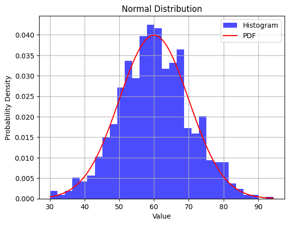
In this example, we generate 1000 fake data points with a mean of 60 and a standard deviation of 10. We then create a histogram to visualize the frequency distribution of the data and overlay a PDF curve to show the theoretical normal distribution. The density=True argument in the plt.hist() function ensures that the histogram is normalized to represent a probability distribution.
You can modify the mean, std_dev, and num_samples values to see how they affect the shape of the distribution. Keep in mind that generating a perfect normal distribution in real-world data is unlikely due to the factors discussed earlier. However, this example helps you understand what a normal distribution looks like and how it can be generated using Python.
Non-normal curves
Healthcare data often deviates from the idealized normal distribution due to a variety of factors inherent to medical and clinical contexts. Here are some reasons why healthcare data may not follow a perfect bell curve:
Biological Variability: Human health and medical conditions are influenced by complex biological processes. Variability in genetic factors, disease progression, and individual responses to treatments can lead to non-standard distributions in health metrics.
Outliers and Extremes: Healthcare data frequently contains outliers and extreme values that can skew the distribution. These outliers can represent rare medical conditions, unusual patient responses, or measurement errors.
Categorical Data: Healthcare data often includes categorical variables such as disease diagnoses, medication types, and medical procedures. Categorical data does not naturally fit a normal distribution; instead, it follows discrete distributions.
Sample Selection: In medical studies, data is often collected from specific patient populations or groups with specific conditions. This targeted sampling can result in distributions that are different from the general population.
Medical Interventions: Interventions, treatments, and medications can significantly impact health metrics. For example, certain medications may lead to a bimodal distribution of a particular health parameter.
Biases and Skewness: Biases in data collection, such as the underrepresentation of certain demographics, can lead to skewed distributions. Skewed distributions can occur when one tail of the curve is longer than the other.
Nonlinear Relationships: Health metrics may have nonlinear relationships with other variables. This can lead to skewed or irregular distributions as data points cluster around certain values.
Complex Interactions: Medical conditions often involve complex interactions between multiple factors, making the data distribution more intricate. Multiple modes or peaks may emerge in the distribution.
Time Series Data: Health data collected over time, such as patient vitals, may exhibit temporal trends, seasonality, and cyclic patterns that deviate from the normal distribution.
Measurement Errors: Measurement errors, instrument calibration, and data recording inconsistencies can introduce noise and deviations from normality.
So in summary, health data distribution curves can take various shapes, each providing insights into different aspects of the data.
Common Shapes
Some common distribution shapes in healthcare data include:
- Normal Distribution (Bell Curve): While not always common in healthcare data, a normal distribution indicates that values cluster around the mean, with fewer extreme values. It suggests that health metrics are relatively consistent within the population.
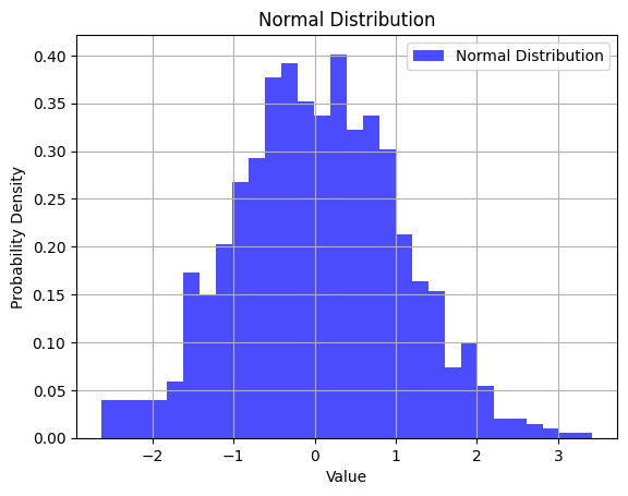
import numpy as np
import matplotlib.pyplot as plt

# Generate data with a normal distribution
mean = 0
std_deviation = 1
normal_data = np.random.normal(mean, std_deviation, 1000)

plt.hist(normal_data, bins=30, density=True, alpha=0.7, color='blue', label='Normal Distribution')
plt.title('Normal Distribution')
plt.xlabel('Value')
plt.ylabel('Probability Density')
plt.legend()
plt.grid(True)
plt.show()
- Skewed Distribution: A skewed distribution occurs when the data is asymmetric. Positively skewed data (skewed to the right) has a tail on the right side, indicating a larger number of lower values and fewer high values. Conversely, negatively skewed data (skewed to the left) has a tail on the left side, with more high values and fewer low values. Skewed distributions can arise from factors such as outliers or limitations in measurement precision.
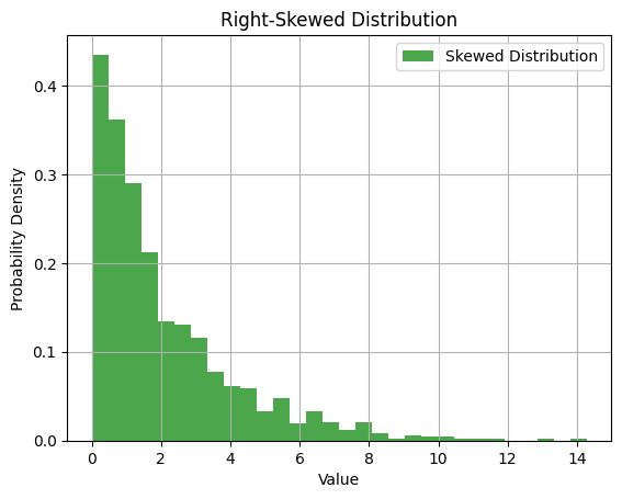
Let's generate a right-skewed distribution:
import numpy as np
import matplotlib.pyplot as plt

# Generate fake data with a right-skewed distribution
skewed_data = np.random.exponential(scale=2, size=1000)

plt.hist(skewed_data, bins=30, density=True, alpha=0.7, color='green', label='Skewed Distribution')
plt.title('Right-Skewed Distribution')
plt.xlabel('Value')
plt.ylabel('Probability Density')
plt.legend()
plt.grid(True)
plt.show()
- Bimodal Distribution: In healthcare, data may exhibit bimodal distribution, indicating the presence of two distinct groups within the population. This could suggest the existence of different patient cohorts or subpopulations with varying health characteristics.
A bimodal distribution has two distinct peaks. Let's generate a bimodal distribution:
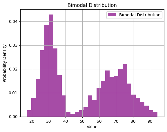
# Generate fake data with a bimodal distribution
bimodal_data = np.concatenate([np.random.normal(loc=30, scale=5, size=500),
                               np.random.normal(loc=70, scale=10, size=500)])

plt.hist(bimodal_data, bins=30, density=True, alpha=0.7, color='purple', label='Bimodal Distribution')
plt.title('Bimodal Distribution')
plt.xlabel('Value')
plt.ylabel('Probability Density')
plt.legend()
plt.grid(True)
plt.show()
- Uniform Distribution: A uniform distribution signifies that values are spread evenly across the range, indicating no dominant trend or pattern. In healthcare, this might be seen in situations where health metrics are evenly distributed among patients.
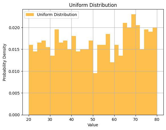
Let's generate a uniform distribution:
# Generate fake data with a uniform distribution
uniform_data = np.random.uniform(low=20, high=80, size=1000)

plt.hist(uniform_data, bins=30, density=True, alpha=0.7, color='orange', label='Uniform Distribution')
plt.title('Uniform Distribution')
plt.xlabel('Value')
plt.ylabel('Probability Density')
plt.legend()
plt.grid(True)
plt.show()
Understanding the shape and skewness of distribution curves is crucial for accurate data analysis and interpretation. While the idealized normal distribution is rare in healthcare due to the complexities and individual variability in health data, recognizing and working with different distribution shapes can lead to more meaningful insights and informed decision-making in healthcare research and practice.
In addition to these shapes, many other non-normal distributions exist:
- Beta Distribution.
- Exponential Distribution.
- Gamma Distribution.
- Inverse Gamma Distribution.
- Log-Normal Distribution.
- Logistic Distribution.
- Maxwell-Boltzmann Distribution.
- Poisson Distribution.
- Skewed Distribution.
- Symmetric Distribution.
- Uniform Distribution.
- Unimodal Distribution.
- Weibull Distribution.
Python provides powerful libraries and tools for analyzing and visualizing distribution curves in health data. You can use these tools to gain insights into the shape of the data, identify outliers, and make informed decisions in healthcare analysis. Here are some ways you can use Python for distribution analysis:
Skewness and Kurtosis
Skewness provides information about the direction and amount of asymmetry in the data. Kurtosis indicates the propensity of the data to produce outliers or extreme values in the tails.
Skewness
Skewness measures the degree of asymmetry of a distribution. A positive value indicates a distribution that is skewed to the right (or positively skewed), while a negative value indicates a distribution that is skewed to the left (or negatively skewed). A value close to 0 suggests that the data distribution is approximately symmetric.
Interpretation of Skewness:
- Positive skewness: The distribution's tail is on the right side. It means that the right tail is longer than the left tail. The mass of the distribution is concentrated on the left. This is also known as a right-skewed distribution.
- Negative skewness: The distribution's tail is on the left side. It means that the left tail is longer than the right tail. The mass of the distribution is concentrated on the right. This is also known as a left-skewed distribution.
- Near zero: If the skewness is close to zero (between -0.5 and 0.5 in many cases), then the dataset is considered fairly symmetrical.
Kurotosis
Kurtosis measures the "tailedness" of a distribution. It compares the tails of the distribution to the tails of a normal distribution. A distribution with a positive kurtosis value indicates that it has heavier tails than a normal distribution, while a negative kurtosis value indicates that it has lighter tails than a normal distribution.
Interpretation of Kurtosis:
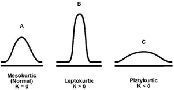
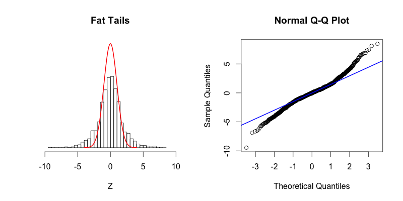
- Positive kurtosis (Leptokurtic - FAT tails): The distribution has heavier tails and a sharper peak than a normal distribution. It indicates a large number of data values far from the mean (outliers).
- Kurtosis > 3 when using fisher=False
- The distribution also tends to have a sharper peak than a normal distribution.
- While a leptokurtic distribution may be "skinny" in the center, it features "fat tails"
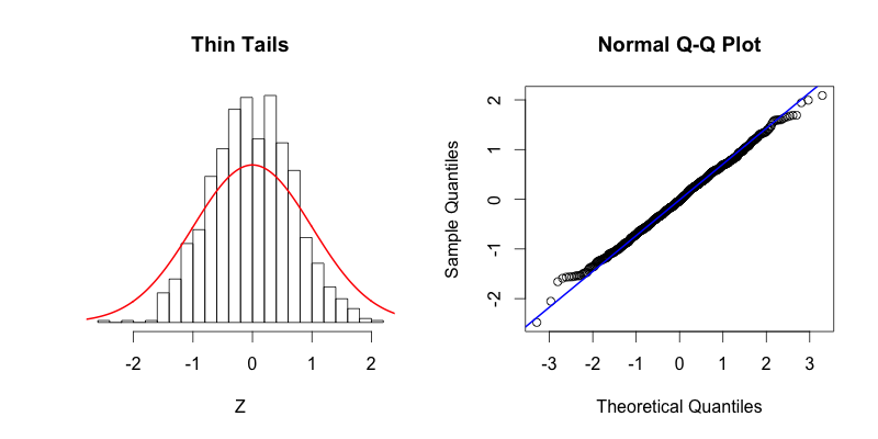
- Negative kurtosis (Platykurtic - THIN tails): The distribution has lighter tails and a flatter peak than a normal distribution. It suggests fewer outliers.
- Kurtosis < 3 when using fisher=False
- The distribution is flatter than a normal distribution
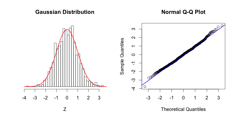
- Zero kurtosis (Mesokurtic): The distribution has the same kurtosis as a normal distribution. It doesn't imply that the distribution is normal, only that its kurtosis is similar to that of a normal distribution.
- Kurtosis ~3 when using fisher=False
- This distribution has the same kurtosis as the normal distribution.
SciPy: You can calculate skewness and kurtosis to quantify the degree of skewness and the shape of the tails in your data distribution.
import numpy as np
import pandas as pd
from scipy.stats import skew, kurtosis
from faker import Faker
fake = Faker()
# Number of data points
n = 1000
# Generate fake patient names
patients = [fake.name() for _ in range(n)]
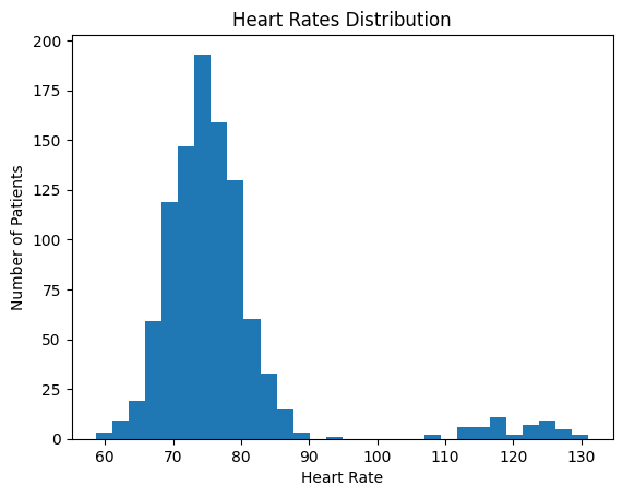
# Generate heart rates that are positively skewed.
# Most patients will have heart rates around 70-80, but some will have higher rates.
heart_rates = np.concatenate([np.random.normal(loc=75, scale=5, size=int(n*0.95)),
np.random.normal(loc=120, scale=5, size=int(n*0.05))])
# Create a DataFrame to store the data
data = pd.DataFrame({
'patient': patients,
'heart_rate': heart_rates
})
# Calculate skewness and kurtosis
skewness = skew(data['heart_rate'])
kurt = kurtosis(data['heart_rate'], fisher=False) # using fisher=False gives a mesokurtic normal distribution a value close to 3
print(f"Skewness: {skewness}")
print(f"Kurtosis: {kurt}")
import matplotlib.pyplot as plt
plt.hist(data['heart_rate'], bins=30)
plt.title('Heart Rates Distribution')
plt.xlabel('Heart Rate')
plt.ylabel('Number of Patients')
plt.show()
Skewness: 2.9837908305203813
Kurtosis: 12.797851079639026
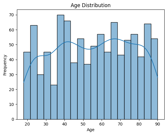
Visualizing Distributions
Matplotlib and Seaborn: Matplotlib and Seaborn are popular data visualization libraries in Python. You can create histograms, density plots, box plots, and violin plots to visualize the distribution of health metrics. These plots help you quickly identify the shape of the data and the presence of outliers.
Below, lets use are same dataset from above:
import matplotlib.pyplot as plt
import seaborn as sns

# Create a histogram
sns.histplot(data['Age'], bins=20, kde=True)
plt.xlabel('Age')
plt.ylabel('Frequency')
plt.title('Age Distribution')
plt.show()
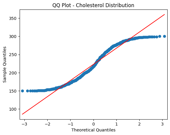
Quantile-Quantile (QQ) Plots
Quantile-Quantile (often abbreviated as QQ) plots are a powerful visual tool used in statistics to assess if a dataset follows a theoretical distribution, most commonly the normal distribution. By comparing the quantiles of your data to the quantiles of a chosen theoretical distribution, you can determine if your dataset deviates from that theoretical distribution and how.
How QQ Plots Work:
Quantiles: Quantiles are points in your data that partition it into equally sized, contiguous intervals. Common quantiles include the median (which divides the data into two halves) and quartiles (which divide the data into four parts).
Plotting Method: In a QQ plot, the x-axis represents the quantiles from the theoretical distribution while the y-axis represents the quantiles from your actual dataset. If your data follows the theoretical distribution, the points on the QQ plot will closely follow a straight line.
Interpreting QQ Plots:
Straight Line: If the points on the QQ plot closely follow a straight line (usually a 45-degree line called the line of equality), it suggests that your data is well-modeled by the theoretical distribution.
Deviations from the Line: If the points deviate from the line, it indicates that your data has some systematic differences from the theoretical distribution.
- Curved Patterns: Often seen in QQ plots of non-normal data. A S-shaped curve might suggest that the data has heavier tails than a normal distribution.
- Outliers: Points that stray far from the line in a QQ plot can suggest potential outliers in your dataset.
Tail Behavior: The ends of the QQ plot (both the lower left and upper right) show the behavior of the tails of your distribution. If the points in these areas deviate significantly from the straight line, it suggests that the tails of your distribution are different from the tails of the theoretical distribution.
Statsmodels: The Statsmodels library provides QQ plots that compare the quantiles of your data against the quantiles of a theoretical distribution. QQ plots help you assess whether your data follows a particular distribution, such as the normal distribution.
import statsmodels.api as sm

# Create a QQ plot
sm.qqplot(data['Cholesterol'], line='s')
plt.xlabel('Theoretical Quantiles')
plt.ylabel('Sample Quantiles')
plt.title('QQ Plot - Cholesterol Distribution')
plt.show()
Shapiro-Wilk Test for Normality
SciPy: The SciPy library includes statistical tests, such as the Shapiro-Wilk test, which assesses whether data follows a normal distribution. This is particularly useful for checking the normality assumption, especially in healthcare data.
from scipy.stats import shapiro

stat, p = shapiro(data['temperature'])
if p > 0.05:
    print("Temperature data follows a normal distribution.")
else:
    print("Temperature data does not follow a normal distribution.")
Using these Python tools, you can gain a deeper understanding of the distribution of health data, identify any departures from normality, and make informed decisions in healthcare analysis based on the shape of the distribution curves.