3.5 Correlations and Covariances in Medical Metrics
In healthcare, understanding relationships between medical metrics is invaluable for clinical decision-making and research.
Correlations and covariances provide insights into how two variables change together, enabling us to uncover patterns and dependencies.
For instance, correlations can highlight whether an increase in cholesterol levels corresponds to an increase in blood pressure. This section delves into the concepts of correlations and covariances within healthcare data. We'll explore Pearson correlation coefficient, Spearman rank correlation, and Kendall's tau-b coefficient as common measures of association. Using Python and pandas, we'll demonstrate how to calculate these coefficients and visualize correlations. We'll also address the nuances of interpreting correlation values and their implications for medical insights. Additionally, we'll discuss the role of covariances in understanding the joint variability of two variables and the differences between covariance and correlation.
Exploring Correlations
Sign of the Coefficient: The sign (positive or negative) indicates the direction of the relationship. Positive values indicate that as one variable increases, the other tends to as well, and vice versa. Negative values indicate that as one variable increases, the other tends to decrease.
Causality: It's important to remember that correlation does not imply causation. Even if two variables are strongly correlated, it doesn't mean that changes in one cause changes in the other.
Sensitivity to Outliers: Pearson's correlation can be sensitive to outliers. Even a single outlier can significantly change your correlation coefficient. Always visualize your data with a scatter plot when assessing correlation to check for outliers or other anomalies.
Pearson Correlation Coefficient
The Pearson correlation coefficient measures the linear relationship between two continuous variables. It quantifies the degree to which the variables tend to increase or decrease together. A coefficient close to +1 indicates a strong positive correlation, while a coefficient close to -1 indicates a strong negative correlation. A coefficient near 0 suggests a weak or no linear relationship.
In a healthcare context, we might explore correlations between metrics like BMI and blood pressure, or age and cholesterol levels. Using Python's pandas library, you can calculate the Pearson correlation coefficient with the .corr() method, and visualize the correlation matrix with a heatmap using libraries like seaborn.
Interpretation
Value of :
- -1.0: Perfect negative linear relationship
- 0: No linear relationship
- 1.0: Perfect positive linear relationship
Interpretation:
- 0.9 ≤ |r| ≤ 1.0: Very strong correlation
- 0.7 ≤ |r| < 0.9: Strong correlation
- 0.5 ≤ |r| < 0.7: Moderate correlation
- 0.3 ≤ |r| < 0.5: Weak correlation
- 0 < |r| < 0.3: Very weak correlation
Research Quesiton Does the body mass index (BMI) of patients have a significant correlation with their blood pressure measurements?
Dataset Description We collected data from a group of patients, including their BMI and systolic blood pressure measurements. The dataset contains information for 100 patients.
Data Preparation
We used the faker library to generate synthetic patient data for BMI and systolic blood pressure, and then conducted a Pearson correlation analysis to understand the relationship between these variables. Next we use the the pandas library and conducted a Pearson correlation analysis to understand the relationship between BMI and systolic blood pressure.
import pandas as pd
from faker import Faker
import random
from scipy.stats import pearsonr

# Initialize faker and random seed
faker = Faker()
random.seed(42)

# Generate synthetic patient data
num_patients = 100
data = {
    "BMI": [random.uniform(18.5, 40.0) for _ in range(num_patients)],
    "Systolic_BP": [random.randint(90, 180) for _ in range(num_patients)]
}

df = pd.DataFrame(data)

# Calculate Pearson correlation coefficient and p-value
pearson_corr, p_value = pearsonr(df["BMI"], df["Systolic_BP"])

print(f"Pearson Correlation Coefficient: {pearson_corr:.2f}")
print(f"P-value: {p_value:.4f}")
Expected output:
Pearson Correlation Coefficient: -0.03
P-value: 0.7655
The Pearson correlation coefficient (r) measures the strength and direction of the linear relationship between two variables. In this case, the Pearson correlation coefficient is approximately -0.03. Since the value is close to zero, it indicates a very weak linear relationship between the "BMI" (Body Mass Index) and "Systolic_BP" (Systolic Blood Pressure) variables.
The P-value associated with the correlation coefficient is 0.7655. This p-value represents the probability of observing a correlation as extreme as the one calculated in the sample data, assuming there is no correlation in the population. In other words, a high p-value suggests that there is no significant evidence to conclude that the correlation is different from zero.
In this scenario, with a p-value of 0.7655, we fail to reject the null hypothesis that there is no correlation between BMI and Systolic Blood Pressure. This implies that the weak correlation we observed is likely due to random chance rather than a true relationship in the population.
Spearman Rank Correlation
ρ or
The Spearman rank correlation measures the monotonic relationship between two variables. It's suitable when the variables don't have a linear association but still exhibit a consistent trend. Spearman's coefficient ranges between -1 and +1, with similar interpretations to the Pearson correlation coefficient.
Healthcare examples where Spearman correlation can be insightful include analyzing the association between pain scores and medication effectiveness, where the relationship may not be linear.
It's particularly useful when data doesn't meet the assumptions of Pearson's correlation (e.g., when data isn't normally distributed or when the relationship isn't linear).
Value of or :
- -1.0: Perfect negative monotonic relationship
- 0: No monotonic relationship
- 1.0: Perfect positive monotonic relationship
Interpretation: The interpretation of the strength of Spearman's correlation is similar to that of Pearson's:
- 0.9 ≤ |ρ or rs| ≤ 1.0: Very strong correlation
- 0.7 ≤ |ρ or rs| < 0.9: Strong correlation
- 0.5 ≤ |ρ or rs| < 0.7: Moderate correlation
- 0.3 ≤ |ρ or rs| < 0.5: Weak correlation
- 0 < |ρ or rs| < 0.3: Very weak correlation
Case study for Spearman
Let's consider a scenario where a medical research team aims to investigate the relationship between patients' cholesterol levels and their blood glucose levels.
Research Question: We aim to explore the potential relationship between cholesterol levels and glucose levels in a group of patients. Specifically, we want to understand whether there is a monotonic correlation between these two health metrics. By calculating the Spearman correlation coefficient and visualizing it, we can determine whether higher cholesterol levels tend to correspond with higher or lower glucose levels, or if there is no significant correlation.
Dataset: Our dataset consists of synthetic patient data, containing two health metrics: "Cholesterol" and "Glucose". Each row in the dataset represents a unique patient, and the values in the columns represent the cholesterol and glucose levels for that patient. The dataset contains 100 patient records, each with a randomly generated cholesterol level (ranging from 120 to 300) and glucose level (ranging from 70 to 200).
Data Preparation: To conduct our analysis, we first create a DataFrame named df using the Pandas library. We populate this DataFrame with fake patient data, where each row represents a patient and contains cholesterol and glucose measurements. We then calculate the Spearman correlation matrix using the corr() function with the method parameter set to 'spearman'. Finally, we visualize the Spearman correlation matrix using the Seaborn library to create a heatmap. The heatmap helps us visually interpret the strength and direction of the monotonic relationship between cholesterol and glucose levels. Warmer colors indicate positive correlations, while cooler colors represent negative correlations.
Python Implementation:
import pandas as pd
import numpy as np
import seaborn as sns
import matplotlib.pyplot as plt

# Create a DataFrame with fake patient data
data = {
    'Cholesterol': np.random.randint(120, 300, size=100),
    'Glucose': np.random.randint(70, 200, size=100)
}
df = pd.DataFrame(data)

# Calculate the Spearman correlation matrix
spearman_corr = df.corr(method='spearman')

print("Spearman Correlation Matrix:")
print(spearman_corr)

# Create a heatmap of the Spearman correlation matrix
plt.figure(figsize=(8, 6))
sns.heatmap(spearman_corr, annot=True, cmap='coolwarm', center=0)
plt.title("Spearman Correlation Heatmap")
plt.show()
Output:
Spearman Correlation Matrix:
             Cholesterol   Glucose
Cholesterol     1.000000  0.014716
Glucose         0.014716  1.000000
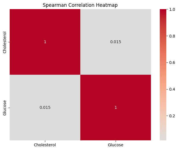
Results Interpretation
The Spearman correlation matrix provides insights into the relationship between cholesterol and glucose levels among the patients. The values in the matrix range from -1 to 1, with values closer to 1 indicating a strong positive monotonic relationship, values closer to -1 indicating a strong negative monotonic relationship, and values closer to 0 indicating little to no monotonic relationship.
In our case, the Spearman correlation coefficient between "Cholesterol" and "Glucose" levels is approximately 0.0147. This value is close to zero, suggesting a very weak monotonic relationship between these two health metrics. This implies that changes in cholesterol levels are not systematically associated with changes in glucose levels among the patients.
The p-value associated with this Spearman correlation coefficient will help determine the statistical significance of the observed relationship. If the p-value is small (typically less than 0.05), we can conclude that the observed correlation is statistically significant and not likely due to random chance. On the other hand, if the p-value is large, the observed correlation may be attributed to random variability.
Pearson vs. Spearman Correlation
In healthcare, both Pearson and Spearman correlations have their place. If you're studying the linear relationship between blood pressure and age, Pearson correlation might be suitable. On the other hand, if you're exploring the relationship between pain levels (ordinal data) and medication dosage, Spearman correlation would be more appropriate.
Selecting the right correlation method depends on the nature of your data and the research question you're addressing. Understanding when to use Pearson and when to opt for Spearman is crucial for drawing accurate insights from your healthcare data.
When to Use Pearson Correlation:
- The variables being examined are continuous and have a linear relationship.
- The data is normally distributed or close to normal distribution.
- You're interested in determining how a unit change in one variable is associated with a unit change in another variable.
When to Use Spearman Correlation:
- The variables are not normally distributed or don't have a linear relationship.
- The variables are ordinal or ranked rather than continuous.
- There's evidence of a monotonic relationship but not necessarily a linear one.
Covariance: Understanding Joint Variability
Covariance quantifies the degree to which two variables change together. However, it doesn't provide a standardized measure of the strength of the relationship. Positive covariance indicates that the variables tend to increase together, while negative covariance suggests that one variable increases as the other decreases.
In healthcare, we might explore the covariance between patient age and the number of medications prescribed. Python's pandas library allows you to calculate the covariance using the .cov() method.
Both covariance and correlation provide information about the direction of the relationship between two variables, but they do so in different ways:
How covariance differs/similar to correlation
While both covariance and correlation provide insights into relationships between variables, they have distinct interpretations. Covariance depends on the units of measurement and doesn't provide a standardized measure. Correlation, on the other hand, ranges between -1 and +1, making it easier to interpret the strength and direction of the relationship.
Correlation:
Direction: Positive Correlation: If the correlation coefficient is positive, it indicates that as one variable increases, the other also tends to increase. Conversely, as one variable decreases, the other also tends to decrease. Negative Correlation: If the correlation coefficient is negative, it suggests that as one variable increases, the other tends to decrease, and vice versa. Strength and Standardization:
Strength/Magnitude: The correlation coefficient is always between -1 and 1. A value close to 1 implies a strong positive correlation, a value close to -1 implies a strong negative correlation, and a value close to 0 implies little to no linear correlation. Because it's standardized, the correlation coefficient provides both a sense of direction and a measure of strength, making it easier to interpret than covariance.
Covariance:
Direction: Positive Covariance: Indicates that the two variables tend to increase or decrease together. Negative Covariance: Indicates that as one variable increases, the other variable tends to decrease and vice versa.
Strength/Magnitude: The magnitude (absolute value) of covariance is not standardized, so it can be any real number. This makes it difficult to interpret the strength of the relationship based on covariance alone.
So while both covariance and correlation indicate the direction of a relationship between two variables, correlation is more interpretable because it also quantifies the strength of that relationship in a standardized manner.
Interpretation:
- Positive Covariance: Indicates that two variables tend to increase or decrease together.
- Negative Covariance: Indicates that as one variable increases, the other tends to decrease and vice versa.
- Covariance of 0: Indicates that the two variables do not show any linear trend together. However, they might still have a non-linear relationship.
Limitations:
- Covariance is sensitive to the units of measurement of both variables. As a result, it is difficult to interpret the magnitude of the covariance value since it isn't standardized.
- Because it doesn't provide a normalized metric, comparing the covariances between different pairs of variables can be misleading.
Example - Covariance
In the context of healthcare, understanding covariance can be valuable. As mentioned, if we're exploring the covariance between patient age and the number of medications prescribed, a positive covariance would suggest that as age increases, the number of medications prescribed also tends to increase. Conversely, a negative covariance would indicate the opposite trend.
For instance, a geriatric patient might have multiple health concerns and might be on several medications, leading to a positive covariance between age and the number of medications.
import pandas as pd

# Sample data
data = {
    'Age': [25, 30, 35, 40, 45, 50, 55, 60, 65, 70],
    'Medications': [1, 1, 2, 2, 3, 4, 5, 5, 6, 7]
}

df = pd.DataFrame(data)

# Calculate covariance
covariance = df['Age'].cov(df['Medications'])
print(f"Covariance between Age and Medications: {covariance}")
Covariance between Age and Medications: 31.666666666666664
While covariance provides directionality of a relationship between two variables, it doesn't give a sense of the strength of the relationship. This is where correlation (pearson/spearman) becomes useful. It standardizes the covariance between -1 and 1, making it easier to interpret the strength and direction of the linear relationship.
In essence, while covariance is a useful starting point to determine if a relationship exists, the correlation provides a clearer, standardized measure of that relationship's strength and direction.
Example - Covariance w/ Matrix
Now if you have multiple continuous variables that you want to compare, you can then create a covariance matrix. A covariance matrix is a square matrix that gives the covariance between each pair of elements of a given random vector (e.g., set of columns, arrays to compare). The covariance matrix is fundamental in multivariate statistics. It provides insight into the relationships between all pairs of variables in a dataset. Techniques that we will learn later, such as Principal Component Analysis (PCA), use the covariance matrix to identify directions of maximum variance in high-dimensional data.
In the below example, we have a dataset with various health metrics for a group of patients: age, weight, height, cholesterol levels, blood pressure, and blood sugar levels. To understand how these health metrics interact with each other, we can compute the covariance matrix. However, remember that while covariance can indicate a direction of relationship, it doesn't provide the strength of the relationship in a standardized manner (that's what correlation matrices do).
import pandas as pd
from faker import Faker
import numpy as np

# Initialize the Faker generator
fake = Faker()

# Number of data points
n = 1000

# Generate data
np.random.seed(42)  # for reproducibility

# Assume age is between 20 and 80, with older ages more likely (right skewed)
ages = np.random.exponential(scale=25, size=n) + 20
ages = np.where(ages > 80, 80, ages)  # Cap age at 80

# Assume weight is somewhat correlated with age (older -> slightly heavier), but with randomness
weights = 50 + ages * 0.5 + np.random.normal(loc=0, scale=10, size=n)

# Assume height has a normal distribution around 170 cm with 10 cm standard deviation
heights = np.random.normal(loc=170, scale=10, size=n)

# Assume cholesterol increases with age but with randomness
cholesterols = 150 + ages * 1.5 + np.random.normal(loc=0, scale=20, size=n)

# Create a DataFrame
data = {
    'Age': ages,
    'Weight': weights,
    'Height': heights,
    'Cholesterol': cholesterols
}

df = pd.DataFrame(data)

# Compute the covariance matrix
cov_matrix = df.cov()

print(cov_matrix)
Results:
                    Age      Weight     Height  Cholesterol
Age          (355.142401)  167.328653  14.232549   521.575174
Weight       167.328653  (176.341907)   5.273661   237.661980
Height        14.232549    5.273661  (94.174529)    27.107896
Cholesterol  521.575174  237.661980  27.107896  (1196.485615)
Interpretation:
The diagonal (in the above output, i have put the diagnoals in ) would give you the variance (spread) of each metric.
Off-diagonal entries would tell you how two metrics vary together. For instance:
- A positive covariance between age and cholesterol levels might suggest that as patients get older, their cholesterol levels tend to rise.
- A negative covariance between weight and height might imply that in this dataset, taller individuals tend to weigh less.
So heres how would we interpret it:
Diagonal Elements: Variances
Age: Variance = 355.142401 This value indicates the spread or dispersion of age data from its mean. A higher variance indicates that the ages are spread out over a larger range.
Weight: Variance = 176.341907 This suggests that the weight data has a decent spread from the average weight.
Height: Variance = 94.174529 This value gives the dispersion of height data from its average value. A lower variance would indicate that most heights are close to the average height.
Cholesterol: Variance = 1196.485615 The cholesterol levels have a wide spread around their mean, as indicated by the high variance.
Off-Diagonal Elements: Covariances
Age and Weight: Covariance = 167.328653 A positive covariance suggests that as age tends to increase, weight also tends to increase, which is in line with the generated data assumption.
Age and Height: Covariance = 14.232549 This value is positive, albeit smaller than the age-weight covariance, indicating that there's a weaker relationship between age and height. As age increases, height might also slightly increase, but the relationship isn't as pronounced.
Age and Cholesterol: Covariance = 521.575174 A strong positive covariance implies that as age increases, cholesterol levels also generally increase, which matches our assumption that cholesterol tends to rise with age.
Weight and Height: Covariance = 5.273661 This value is positive but relatively low, indicating that there's a weak relationship between weight and height. As weight slightly increases, height might also slightly increase.
Weight and Cholesterol: Covariance = 237.661980 Positive covariance here means that there's a tendency for higher weights to be associated with higher cholesterol levels.
Height and Cholesterol: Covariance = 27.107896 The relationship between height and cholesterol is weakly positive based on this covariance value.
Here's another example of generating fake patient data using the Faker package and then demonstrating the concept of covariance.
In this example below, we generate fake patient data including the patient's age, blood pressure, cholesterol level, and glucose level.
We then calculate the covariance matrix between the "Cholesterol" and "Glucose" variables to understand the joint variability between these two health metrics. The covariance matrix provides insights into how these two variables change together and whether their changes are positively or negatively related.
from faker import Faker
import pandas as pd
import numpy as np

# Initialize the Faker generator
fake = Faker()

# Generate fake patient data
num_patients = 100
data = {
    "Patient_ID": [fake.unique.random_int(min=1000, max=9999) for _ in range(num_patients)],
    "Age": [fake.random_int(min=18, max=80) for _ in range(num_patients)],
    "Blood_Pressure": [f"{fake.random_int(min=100, max=150)}/{fake.random_int(min=60, max=100)}" for _ in range(num_patients)],
    "Cholesterol": [fake.random_int(min=120, max=300) for _ in range(num_patients)],
    "Glucose": [fake.random_int(min=70, max=200) for _ in range(num_patients)]
}

df = pd.DataFrame(data)

# Calculate the covariance matrix
covariance_matrix = np.cov(df[["Cholesterol", "Glucose"]].values.T)

print("Fake Patient Data:")
print(df.head())

print("\nCovariance Matrix:")
print(covariance_matrix)
Expected output:
Fake Patient Data:
   Patient_ID  Age Blood_Pressure  Cholesterol  Glucose
0        2757   31         116/87          217      140
1        8092   19         140/90          122      106
2        1851   65         141/93          220      113
3        4462   75         129/67          258      111
4        6569   48         148/70          257      160

Covariance Matrix:
[[2508.31555556 -211.34505051]
 [-211.34505051 1604.26707071]]
Interpretation:
Diagonal Elements: Variances
Cholesterol: Variance = 2508.31555556 This value indicates how spread out the cholesterol data is from its mean. A higher variance implies that the cholesterol levels vary considerably from the average value across patients.
Glucose: Variance = 1604.26707071 This suggests that the glucose levels also have a reasonable spread from their average value across patients.
Off-Diagonal Elements: Covariances
Cholesterol and Glucose: Covariance = -211.34505051 The negative covariance suggests an inverse relationship between cholesterol and glucose levels. As one tends to increase, the other tends to decrease, albeit not too strongly. This could mean that some patients with higher cholesterol have slightly lower glucose levels and vice versa.
Since the covariance matrix is somewhat hard to interpret here, so lets use a visualization package seaborn to help:
import matplotlib.pyplot as plt
import seaborn as sns

# Generate fake patient data (same as previous example)
# ...
# ......previous code goes here

covariance_matrix = np.cov(df[["Cholesterol", "Glucose"]].values.T)

# Create a heatmap of the covariance matrix
plt.figure(figsize=(8, 6))
sns.heatmap(covariance_matrix, annot=True, fmt=".2f", cmap="coolwarm",
            xticklabels=["Cholesterol", "Glucose"], yticklabels=["Cholesterol", "Glucose"])
plt.title("Covariance Matrix")
plt.show()
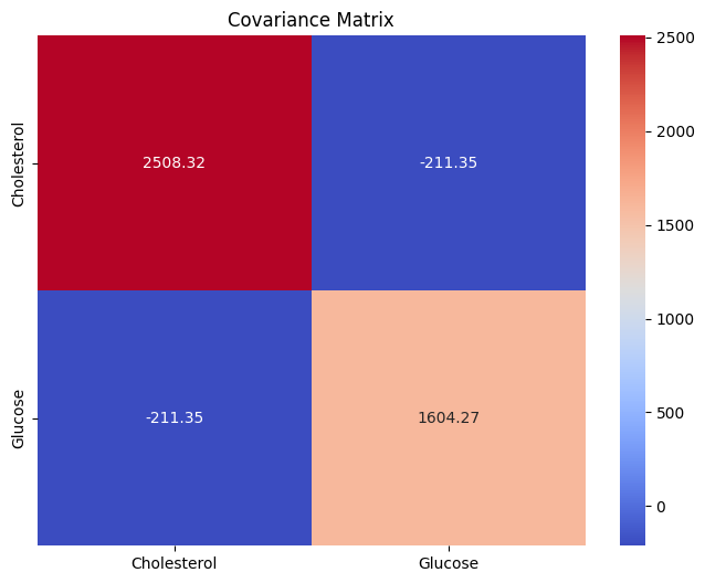
The heatmap visually represents the covariance values between the "Cholesterol" and "Glucose" variables.
Positive values are indicated by warmer colors (reds), while negative values are indicated by cooler colors (blues). The annotations inside the cells of the heatmap show the covariance values. This visualization helps us understand the strength and direction of the relationship between the two variables.
Understanding the joint variability of medical metrics can reveal important insights, especially when considering factors that might influence patient health.
To summarize, exploring correlations and covariances is a fundamental step in healthcare data analysis. These measures enable us to uncover hidden relationships, identify potential confounding factors, and guide further research to improve patient care and outcomes.